Fantage Cheats, Secrets, Glitches, Info & Help.
|
| | | banner. |  |
| | | Author | Message |
|---|
rice
Senior Fantagian

Posts : 286
Join date : 2013-10-05
Age : 24
Location : Italy Babe √
| Subject: banner.  Mon Oct 14, 2013 7:15 pm Mon Oct 14, 2013 7:15 pm | |
| 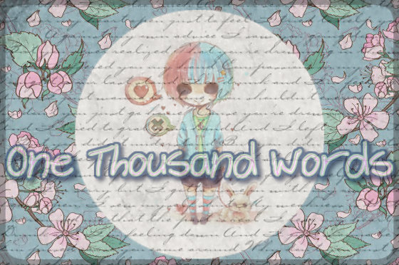 I been working on this for 2 days. Rate and critque. | |
| | | | X
Passionate Fantagian

Posts : 913
Join date : 2013-09-28
Age : 25
| | Subject: Re: banner. Mon Oct 14, 2013 7:26 pm | |
| Nothing else to say but : 8.6/10. Nice job.
Last edited by Angelic on Sun Oct 20, 2013 8:04 am; edited 1 time in total | |
| | | | Snow
Legendary Fantagian

Posts : 11487
Join date : 2012-08-21
Age : 22
Location : Forever young
| | Subject: Re: banner. Mon Oct 14, 2013 7:31 pm | |
| Wow that is better than the banners I make! Wayy better 10/10 | |
| | | | rice
Senior Fantagian
Posts : 286
Join date : 2013-10-05
Age : 24
Location : Italy Babe √
| | Subject: Re: banner. Mon Oct 14, 2013 7:41 pm | |
| Thankies candies (:
Appreciate your luv ♥ | |
| | | | Kennedy
Loyal Fantagian

Posts : 1758
Join date : 2013-02-11
Age : 24
Location : Finnland
| | Subject: Re: banner. Mon Oct 14, 2013 9:22 pm | |
| Wow that's hot. You can make good banners. 10. | |
| | | | Justin.
New Fantagian

Posts : 19
Join date : 2013-09-07
Age : 23
Location : U.S.A
| | Subject: Re: banner. Tue Oct 15, 2013 6:03 am | |
|
Hey Dulce, I'll give you some critique:
The typography "One Thousand Words", does it really need to be in low opacity? Where's your focal?
And I think the small typography all over your canvas is unnecessary. And if you're trying to make the kid your focal..
you shouldn't have decreased its opacity. Imo, transparency isn't good all of the time and applying too much transparency isn't good either.
I apologize that my critique is harsh.
I suggest that you try to avoid too much transparency and try to experiment and look for tutorials.
Deviantart has a lot of tutorials about graphics and so on.
8/10. :)good work. (y) | |
| | | | Kennedy
Loyal Fantagian
Posts : 1758
Join date : 2013-02-11
Age : 24
Location : Finnland
| | Subject: Re: banner. Tue Oct 15, 2013 3:43 pm | |
| - markus. wrote:
Hey Dulce, I'll give you some critique:
The typography "One Thousand Words", does it really need to be in low opacity? Where's your focal?
And I think the small typography all over your canvas is unnecessary. And if you're trying to make the kid your focal..
you shouldn't have decreased its opacity. Imo, transparency isn't good all of the time and applying too much transparency isn't good either.
I apologize that my critique is harsh.
I suggest that you try to avoid too much transparency and try to experiment and look for tutorials.
Deviantart has a lot of tutorials about graphics and so on.
8/10. :)good work. (y) I think it is fine the way she had it. And the words overlay indicated "one thousand words" anyways thats my opinion. | |
| | | | Sponsored content
| | Subject: Re: banner. | |
| |
| | | | | | banner. | |
|
Similar topics | |
|
| | Permissions in this forum: | You cannot reply to topics in this forum
| |
| |
| | Copyright Notice | | All images & videos are copyright Fantage.com, Inc. Fantage Forum does not own any Fantage designs, images, videos, pictures, etc. |
| Who is online? | In total there are 17 users online :: 0 Registered, 0 Hidden and 17 Guests :: 1 Bot None Most users ever online was 343 on Wed May 26, 2021 11:04 pm |
|
|


